Key Takeaways
- Choosing the right blog layout improves readability and user experience, making your content accessible and engaging.
- Elements such as clear navigation, readability, and thoughtful visual hierarchy directly impact audience retention.
- Real-world examples offer actionable insights for implementing effective designs on your blog.
Creating an engaging and user-friendly blog layout is essential for content creators who want to captivate their audience and encourage deeper engagement. A well-structured blog design goes beyond looks. It increases readability, fosters trust, and helps visitors navigate content seamlessly. If you need inspiration for your next project, explore successful blog examples that showcase how impactful design can shape readers' experiences.
Understanding which blog layout to choose makes a significant difference in how your message is received. Thoughtful design will highlight your strongest stories, boost engagement, and form a foundation for long-term growth. We will discuss the leading blog layouts used today and explain the essential elements that can enhance any design.
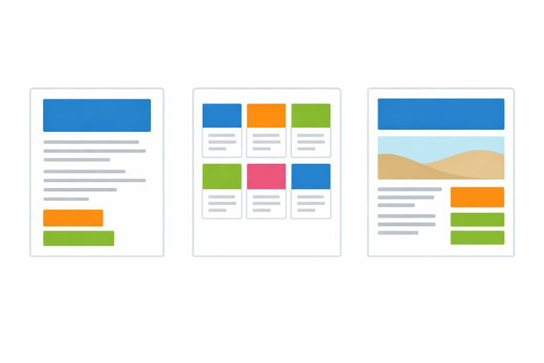
The Single-Column Long-Form Layout
Creators who publish detailed articles often choose the single-column layout. This straightforward design reduces distractions by removing sidebars and extra widgets, allowing readers to focus solely on your content. Platforms such as Medium exemplify how minimalist layouts can keep audiences engaged, making every word count. The simplicity also ensures posts appear consistently across devices, and improved readability often means visitors spend more time on each page.
For bloggers who want to build authority in their niche and create a narrative-driven experience, the single-column format puts storytelling front and center. Careful use of headings, images, and well-placed call-to-action buttons can further enhance the reading journey while maintaining the serene, gentle, uninterrupted scroll.
One standout aspect of the single-column approach is its ability to create a distraction-free reading environment. This layout is particularly effective for content-heavy sites, educational blogs, or publications looking to immerse readers in a narrative without interruptions. Furthermore, strategically leveraging whitespace in a single-column format draws attention to key elements and improves overall clarity, particularly in long-form storytelling or educational guides.
Another benefit is accessibility. Simple layouts naturally accommodate various screen-readers and accessibility tools, making your content more inclusive. When combined with accessible color schemes and a clean typographic hierarchy, single-column layouts ensure your message reaches the widest possible audience.
The Card-Based Grid Layout
If your blog publishes high volumes of content, or you want visitors to discover a variety of topics at a glance, the card-based grid layout is particularly effective. Each article is presented as its own “card,” typically featuring an eye-catching image, a headline, and a brief excerpt. This approach allows users to quickly scan multiple posts and select topics that interest them most. TechCrunch is a great example of a site that leverages a card grid layout to make large amounts of content navigable and engaging.
In addition to offering choice, the card-based design supports strong visual organization, letting readers filter and prioritize information efficiently. This modern structure reduces bounce rates by making each visit an opportunity to explore related stories and discover fresh content.
Card-based grids also adapt well to responsive design requirements. With content blocks that dynamically rearrange for different screen sizes, these layouts maintain usability across devices. Moreover, the modular nature of cards makes it easy to implement categories, tags, or highlight trending posts. Adding interactive elements, such as hover effects and subtle transitions, can further enhance the visual appeal and encourage greater interaction with your content archive.
Another advantage is flexibility. As your blog’s content library grows, a card grid lets you experiment with different media or post formats, such as video previews, podcast snippets, or featured galleries, offering a richer, more diverse browsing experience for every visitor.
The Magazine-Style Layout
For content creators who want to emulate editorial authority and showcase multiple content types, the magazine-style layout uses asymmetric grids and strategic visual hierarchy. This layout highlights a hero post as the main feature, surrounded by supporting articles in varying sizes and positions. The format mirrors the front pages of established news outlets; sites like The New York Times display expertly crafted magazine-style layouts that visually guide the reader’s eye through curated selections of stories while signaling credibility and professionalism.
Magazine-style layouts are ideal for blogs with frequent updates, sections, or contributors. They allow for storytelling through visuals and structure, offering a bold yet organized first impression.
With the magazine style, you can highlight a broader range of voices and formats. You can dedicate sections to featured interviews, reviews, opinion columns, or multimedia elements. By carefully managing content density and column widths, you can avoid visual clutter while still delivering a dynamic, information-rich experience. Consider utilizing color accents or distinctive section headers to reinforce structure and brand identity, guiding readers through different content streams without overwhelming them.
This layout is also ideal for surfacing evergreen content or for showcasing sponsored features alongside your primary articles, boosting both long-term engagement and monetization opportunities.
Essential Elements to Enhance Blog Layouts
No matter which blog layout you choose, several core elements can transform the entire page experience:
- Clear Navigation: Intuitive menus and category links help readers quickly find the content they are seeking.
- Readability: Choose legible fonts, balanced line spacing, and high-contrast colors for easy reading on any device.
- Visual Hierarchy: Leverage headings, subheadings, bullet points, and relevant images to break up text and direct the reader’s attention.
- Responsive Design: Ensure your layout adapts seamlessly to screens of all sizes. Most modern users expect a fluid experience across desktop, tablet, and smartphone. For more actionable tips, resources like Computer Tech Reviews offer expert advice on responsive best practices.
Another essential element is page speed. Optimizing image sizes, using efficient code, and limiting unnecessary scripts all contribute to faster load times, which directly impacts user satisfaction and search engine rankings. Thoughtful consideration of whitespace, easily accessible search bars, and integrated social sharing buttons can also enhance interactivity and help build an engaged community around your content. Remember, small details such as sticky navigation bars, well-labeled buttons, and a consistent visual theme go a long way in fostering brand recognition and loyalty.
Accessibility should never be overlooked. Use alt text for all images, ensure proper color contrast, and provide keyboard navigation support to make your blog inclusive for all users. Consider how your site’s structure works with assistive technologies so that everyone can enjoy your content equally.
Real-World Examples of Effective Blog Layouts
- Medium: Known for its minimalist single-column layout, Medium ensures that content remains center stage and distraction-free.
- TechCrunch: TechCrunch’s card-based grid layout makes scanning through tech news simple and efficient for its readers.
- The New York Times: Using an adaptive magazine-style structure, it creates curated reading paths with featured articles and compelling secondary content.
By examining these examples, you can identify specific features that suit your blogging goals. It's useful to revisit popular design periodically for inspiration. Doing so helps you spot emerging trends, assess new plugins or widgets, and gain insight into how top publishers evolve their layouts over time. When analyzing real-world layouts, focus on user feedback, comments, and engagement metrics, as these data points often reveal what works best for specific audiences or niches.
Conclusion
Choosing an effective blog layout is crucial for content creators looking to engage and retain their audience. By understanding the strengths of each layout and integrating key design principles, you can craft a reading experience that is visually appealing, highly navigable, and optimized for every visitor. The most successful creators continually analyze inspiring examples and adapt their designs, ensuring that their blogs remain both compelling and competitive in an ever-evolving digital landscape.
Ultimately, your blog’s design is an extension of your brand and your voice. Don’t be afraid to experiment, test different layouts, gather feedback, and make incremental improvements over time. Whether your focus is storytelling, news updates, or thought leadership, the right layout, combined with solid fundamentals, will help your blog reach its full potential and leave a lasting impression on every visitor.

Leave a Reply